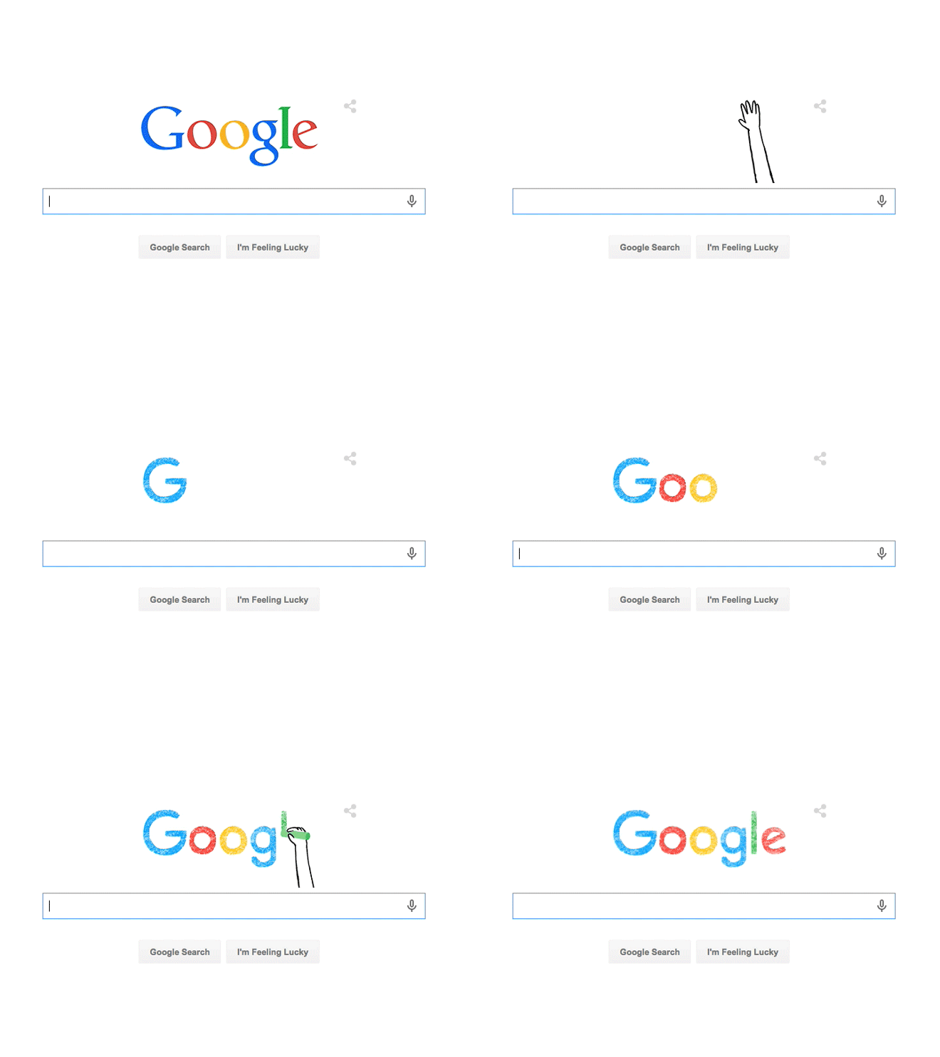
Last week, Google’s iconic Google Doodle, rather than being a tribute to a civil rights leader, a long-forgotten inventor, or a popular sporting event, acted as an announcement that Google had, after sixteen years, updated it’s brand.

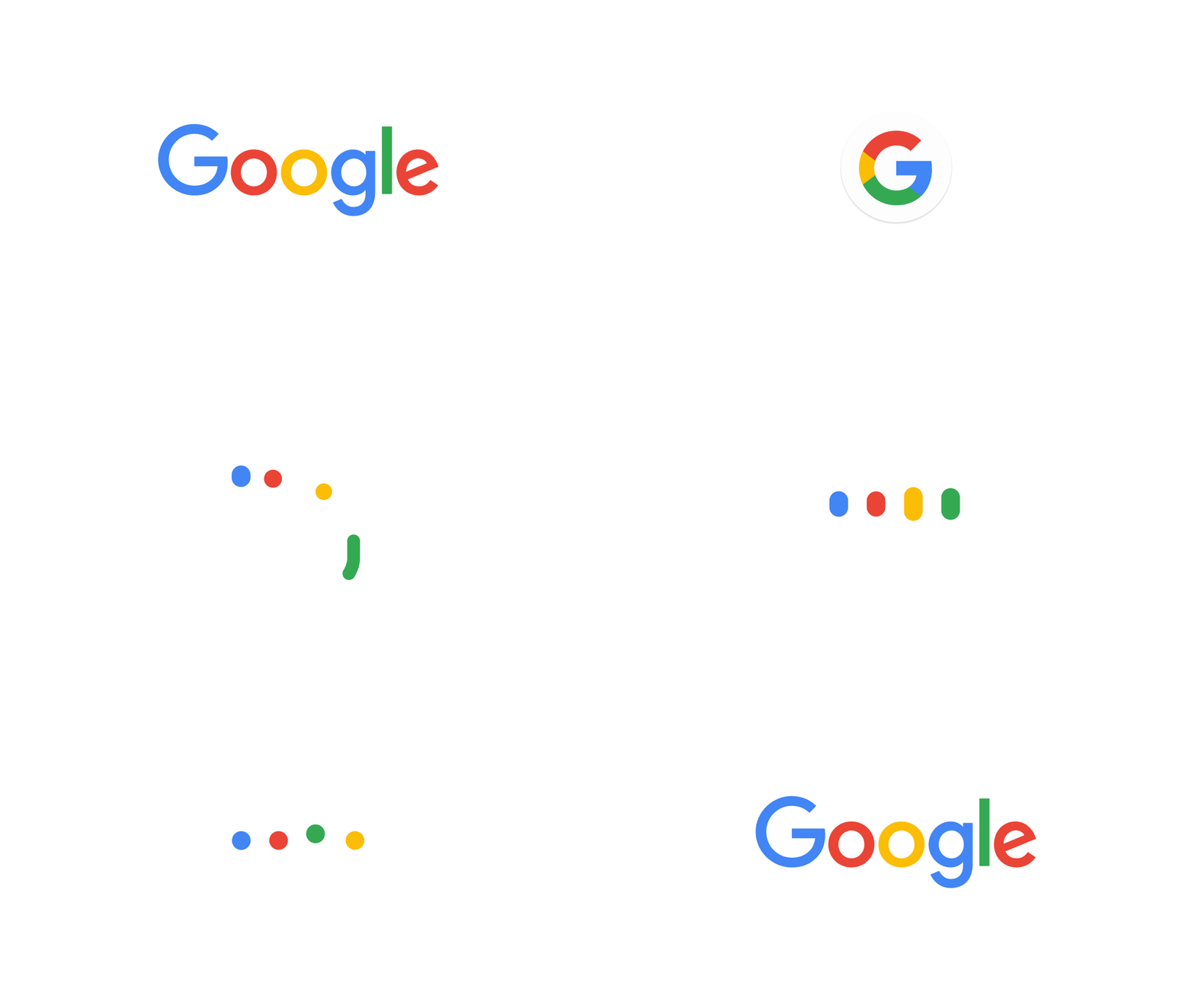
While some have lamented over the new logo, likening it to “children’s refrigerator magnets, McDonald’s French fries, Comic Sans,” I think that it is rather good. The new quad-color favicon makes sense, and is legible on a small tablet or a high density Retina display. The new “dots” which shows when Google is “listening, thinking, replying, incomprehension, and confirmation” is clever and intuitive. I instinctively could tell exactly what they were trying to convey, which is very slick.

As Google rolls out it’s new logo over the next month, I’m sure that those that “hate” the new logo will get used to it, those that have no opinon on it will carry on, and those that like it will grow to like it a little more with each passing day. I’m pretty sure that I’m in the “I like it!” camp, and look forward to seeing Google’s new face roll out for all of their products.