I’ve used a number a frameworks in the past, and while they are extremely helpful, I often found myself asking “is this the best way to be doing this?” On one hand, every framework that I used looked great and had extensive documentation. On the other, each time I used one, I felt like my HTML would slowly become a very heavy mess to look at, with every single bit of HTML having a class:
<div class="container">
  <div class="row">
    <div class="col-md-1">
      <p>
        ...
      <p>
      <button class="btn btn-default" type="submit">...
    </div>
  </div>
</div>
While at first it seems like a daunting task, creating your own framework is a relatively simple affair, and it definitely worth the effort. In the end, I learned a lot and now have a simple framework that I can use in the future that I happen to also know inside and out.
The Basics
Set the Viewport
Setting the viewport allows you to define width of the page, and subsequently ensures that there are no horizontal scrollbars on when viewed on a desktop and that mobile users don’t have to deal with zooming in or out to view your content.
<meta content="width=device-width, initial-scale=1" name="viewport">
Deal with Browser Oddities
Every browser has it’s own quirks and subtly different ways of styling content. The best way with dealing with this is to use some CSS that tries to ensure that users, regardless of browser, have a consistant user experience. There are a few ways of doing this, one of the easiest being Normalize.css.
<link href="https://cdnjs.cloudflare.com/ajax/libs/normalize/3.0.3/normalize.min.css" rel="stylesheet">
Use Border-Box for Everything
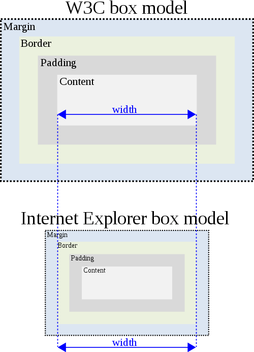
The CSS box model is kinda weird, as it doesn’t quite work the way that one would think it would. Say you have a 400px × 300px object. If you add 10px of padding to it, you suddenly have a 420px × 320px object. Not cool. Luckily, we can solve this issue with a tiny bit of CSS:
*, *:before, *:after{
  box-sizing: inherit;
}
html{
  box-sizing: border-box;
}
Breakpoints
Breakpoints (@media) are a nice way of allowing you to change your CSS stylings based on the size of the screen that your page is viewed on. (You can also change the style of your page based on whether or not your page is being displayed on a screen or being printed, but I’m not going to worry about that right now.)
Mobile First
One simple way of dealing with breakpoints is to style your page is to style everything to look good on mobile and then work your way up to larger screen sizes. The best way to go about this is to style your CSS and at the end of your sheet, add in the appropriate @media breakpoints for larger screens at the end:
/* MOBILE STYLES */
body{
  ...
}

/* DESKTOP STYLES */
@media screen and (min-width: 800px){
  body{
    ...
  }
}
Grids
Almost every framework you come across has some sort of grid system, allowing you to easily position content on your page. While nice, they aren’t very semantic, and once you have enough of them, it can get confusing.
Flexbox
The good news is that you can replace this system with a very nice and super simple grid system using flexbox and the HTML5 tags section and article.
You first start out with the CSS for sections, which will act as a container/row for your article/columns:
/* MOBILE STYLES */
section{
  display: flex;
  flex-direction: row;
  flex-wrap: wrap;
}

article{
  flex-basis: 100%;
}

/* DESKTOP STYLES */
@media screen and (min-width: 800px){
  article{
    flex: 1;
  }
}
Once you’ve added in your CSS, the HTML is super simple as well:
<section>
  <article>
    ...
  </article>
  <article>
    ...
  </article>
</section>
You now have a responsive grid that will look nice on mobile, and will be nice and spread out on a larger screen. If you want, you can leave things as is, or add in some classes to give you the option of having “uneven” colums:
/* DESKTOP STYLES */
@media screen and (min-width: 42em){
  article{
    flex: 1;
  }

  /* flex fractions */
  .one-whole{
    flex: 1 1 100%;
    max-width: 100%;
  }

  .one-fourth, .one-quarter{
    flex: 1 1 25%;
    max-width: 25%
  }

  .one-third{
    flex: 1 1 calc(100% / 3);
    max-width: calc(100% / 3)
  }

  .one-half{
    flex: 1 1 50%;
    max-width: 50%;
  }

  .two-third{
    flex: 1 1 calc(100% * (2 / 3));
    max-width: calc(100% * (2 / 3));
  }

  .three-fourth, .three-quarter{
    flex: 1 1 75%;
    max-width: 75%
  }
}
Styling
Now that you have the basics set up and a grid to use, you are now free to style the rest of the elements that will be on your pages. I went about this by only styling the HTML elements that are semantic, and taking advantage of the new HTML5 tags that are semantic such as header, nav, main, footer, etc…
Some of the guidelines for styleing that I used were:
Font Size
Screens are getting bigger, but the default size of 16px used by most browsers doesn’t appear to be catching up anytime soon. Play around with your font-size until you find something that looks good. (I use font-size: 20px.)
Line Heighting
Increasing the spacing between each line on the screen helps with legibility. I’m not suggesting double spacing your text as you would when writing a term paper, but something around 1.4 to 1.6 works pretty well. (I use line-height: 1.6.)
Line Width
No one wants to read a 200-300 character wide piece of body across a 32" widescreen monitor. It’s best to limit the width of your main content. (I use max-width: 42em—with a font-size of 20px, the maximum width of my content is 840px.)
Colors
No one likes to read a pure black text on a completely white page. Pick an dark gray for your fonts (I used #212121) and an off white for your background (I used #FAFAFA).